Brand
Mothercare
Company
Kanmo Group
Industry
Retail E-Commerce
Aug 3, 2020
-
Sep 1, 2023
UX Research & Design
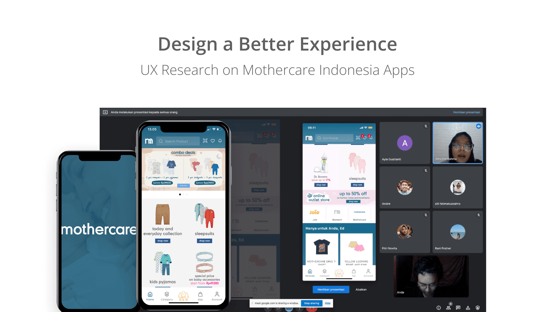

Mothercare
Platform
Mobile Application Design
Tags
UX Research, Revamping website
iOS Application
Android Apps
Website
Visit website
Prototype
About project
This project focuses on improving the Mothercare Indonesia mobile app’s user experience using the Design Thinking approach. Through user research and usability testing with millennial parents, key pain points were identified, including inefficient navigation, difficulties in product search, and a complex checkout process. Insights from this research were structured using an Affinity Diagram to define core usability challenges and inform design decisions. Based on the findings, several solutions were developed, such as enhancing navigation, optimizing search functionality, and simplifying the checkout process. These improvements were translated into wireframes and prototypes, which were then tested with users to validate their effectiveness. The results provided actionable insights for the product team, leading to a more user-friendly shopping experience tailored to Indonesian families.


Product story
Research Analyst Project
As a UX Researcher, I was responsible for analyzing the user experience of the Mothercare Indonesia application, identifying strengths, challenges, and opportunities for improvement to enhance the online shopping experience for modern parents (Milenials Generations).
Primary Objectives of the Research:
Understand how users first interact with the Mothercare app.
Identify the features they like and the challenges they face.
Analyze the checkout process and determine whether users find it convenient.
Discover opportunities for feature enhancements based on user feedback.
Provide recommendations to improve the user experience and increase user retention.
User Testing Participants Profile
The usability testing involved six participants selected based on the target user criteria of the Mothercare app—young parents or expectant parents who frequently shop for baby essentials online. Below is a summary of their characteristics:
Age Range: 24 - 26 years old
Occupation: Engineer, Analyst, Administrative Staff, Educator, Employee
Device Used: Mostly Android, with some using iOS
Familiarity with Mothercare:
3 participants had previously shopped at Mothercare
2 participants were aware of Mothercare but had never shopped there
1 participant had never heard of Mothercare before
Key Research Findings:
Positive first impressions → Most users described the interface as clean, simple, and easy to understand.
Image loading issues → Some users experienced delays in product images loading, which disrupted the shopping experience.
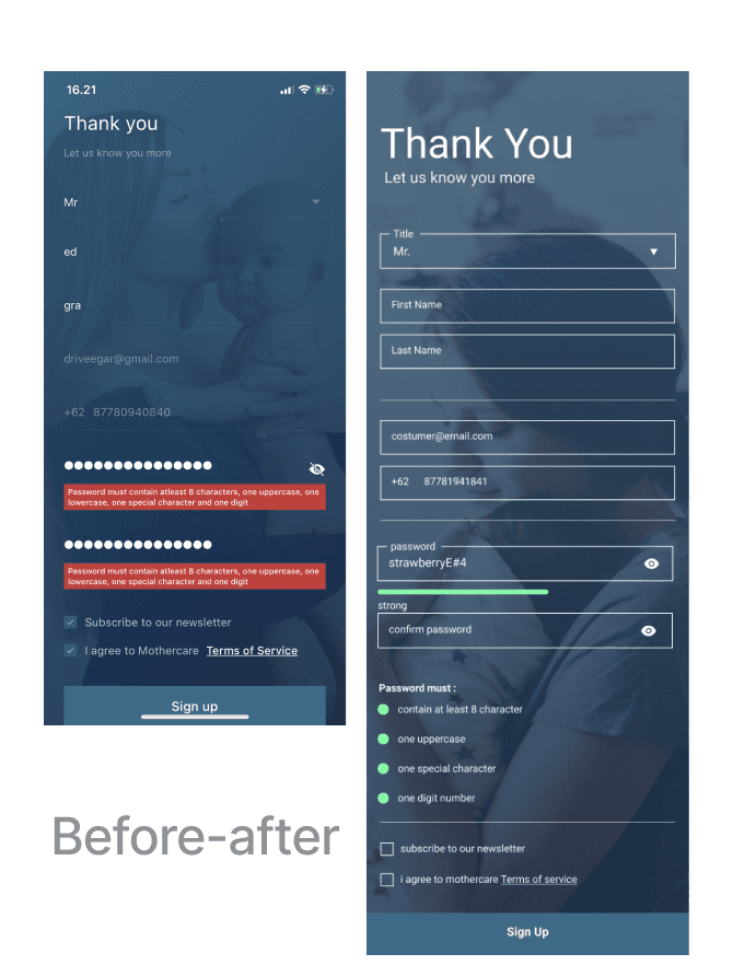
Checkout process is generally easy, but registration had challenges, especially password complexity requirements.
Favorite features → Parenting articles, product price comparison, and well-categorized product listings.
Requests for new features → Most users wanted clearer visibility of promotions and vouchers before checkout.
The insights from this research served as the foundation for designing a more user-friendly solution and enhancing the app’s usability.
Ideation and conceptualization
After identifying key issues from user testing, a brainstorming session was conducted to generate solutions. The research findings were organized using an Affinity Diagram, helping to detect patterns in user challenges.
From this, several key solutions were developed:
Optimized navigation structure → Making it easier for users to browse product categories.
Performance improvements → Reducing image loading times to enhance responsiveness.
Simplified registration process → Adjusting password requirements to be more user-friendly while maintaining security.
Promo recommendations → Displaying applicable discount vouchers before users reach the checkout page.
Expanded parenting features → Offering more structured and informative content on pregnancy, baby care, and parenting tips.
These ideas were then translated into wireframes before further user testing.
Design solution process
This stage involved an iterative design process based on research findings and conceptualized solutions.
1. Wireframing & Prototyping
Low-Fidelity Wireframes were created to explore new layouts and interaction flows.
High-Fidelity Mockups were developed to provide a more realistic representation of the final product.
Interactive prototypes were built using Figma for further user testing.
2. Usability Testing (Design Iteration)
Once the prototypes were created, another round of testing was conducted with users to validate whether the new solutions effectively addressed previous challenges.
Test results revealed:
Improved navigation satisfaction with a more intuitive menu structure.
Faster image loading, reducing friction during shopping.
Simplified registration, with more flexible yet secure password requirements.
Clearer promo visibility, making it easier for users to identify available discounts.
Following this, refinements were made before handing the final designs over to the development team.
Key Achievements, Impact & documentation
Key Achievements:
✅ Improved navigation → Easier product browsing.
✅ Optimized app performance → Faster image loading and a smoother shopping experience.
✅ More efficient checkout process → Simplified registration requirements for a better user experience.
✅ Clearer promo visibility → Discount vouchers are now easier to find before checkout.
✅ Enhanced parenting content → More structured parenting articles to increase user engagement.
✅ High user satisfaction → Most participants reported that the checkout process was easy and enjoyable.
✅ Majority of participants would recommend the Mothercare app → All participants agreed that the app is worth recommending to friends and family for baby and maternity shopping.
Impact:
📈 Increased UX Score → Based on usability testing, overall user experience showed significant improvements after the design changes.
📊 Potential conversion rate increase → Users felt more comfortable with the purchasing process, potentially leading to higher transaction rates.
🎯 Most participants were satisfied with the available features → The price comparison tool, parenting articles, and product categories were considered highly useful.
💡 Key insights from user feedback:
Positive first impressions → Most participants found the app easy to understand.
Smooth checkout process, but initial login could be further refined.
Some participants wanted more specific product categories to simplify searching.
Documentation:
All research data, wireframes, prototypes, and usability testing feedback were documented thoroughly to serve as a reference for product development teams and stakeholders in future iterations.
RELATEd with
Mothercare
EXPLORE project from
Kanmo Group


© 2024 Edgardo Hamdola. All rights reserved.